Color forecasts for the holiday season shift each year, and paying attention to where designers, retailers, and homeowners are heading can make your decor choices feel more intentional. Whether you are refreshing your home or planning a neighborhood display, understanding the trending Christmas colors 2025 landscape adds clarity to a fast changing world of holiday style.
This year’s palette leans into warmth, modern elegance, and a bit of playful experimentation. As you explore new shades, it helps to consider how lighting supports those choices, since many homeowners planning color themes also think about upgrading their tree lights, indoor accents, or outdoor setups. Professional Christmas lights installation can create a cohesive look by tying those colors and lighting elements together.
If you are planning an exterior refresh in the northern suburbs, you can easily bring your color selections outdoors with professionally installed displays. When exploring ideas for outdoor palettes, it is natural to consider support like Christmas lights installation in Alpharetta which helps ensure that your color selections translate with precision in real lighting conditions.
Here’s how this guide is organized so you can move directly to the topics that interest you most.
What This Guide Will Explore
- Why Color Forecasts Matter for Holiday Decor
- Classic Palettes Reimagined for Modern Homes
- Bold Experimental Shades Arriving for 2025
- How Cultural Shifts Shape Holiday Color Directions
- Pairing Materials and Textures With This Year’s Palette
- How Lighting Interacts With Color Themes Indoors and Outdoors
- Creating Neighborhood Friendly Exterior Color Concepts
- How Tree Decor Evolves With Trending Christmas Tree Colors
- Expert Tips for Blending Trendy Shades With Long Term Styles
- Looking Ahead at the Palettes Influencing Holiday Seasons Beyond 2025
Why Holiday Color Forecasts Continue to Evolve
Color forecasting has grown more sophisticated in recent years as design professionals, retailers, and homeowners rapidly adopt new palettes that align with cultural mood, design cycles, and product availability. The process begins months or even years before a season launches. Trend researchers observe shifts in interior design, fashion, social media behaviors, manufacturing capabilities, and even lighting technology before making predictions.
The main benefit of understanding these directions lies in the ability to make intentional and visually cohesive choices. A color theme brings personality to a space, whether it is a small tabletop arrangement or an expansive exterior display. When you explore palettes connected to Christmas 2025 trending colors, it becomes clear that these shades reflect deeper shifts in what people want to feel during the season. Many homeowners now seek comfort, familiarity, craftsmanship, and warmth paired with gentle innovation rather than drastic novelty.
Even long loved palettes evolve subtly. Reds move toward deeper berry notes. Greens shift toward natural botanical tones. Metallics land in softer, more dimensional finishes instead of high shine surfaces. The trending Christmas colors 2025 palette captures all of these ideas in fresh, flexible ways.
Classic Shades Return With Thoughtful Updates
Traditional Christmas colors never disappear. Instead, they gradually shift to match the design world’s broader rhythm. In 2025, red and green remain prominent, but with specific character changes that reflect a preference for natural depth. Reds lean toward mulberry, cranberry, and wine. Greens appear more botanical, resembling juniper, balsam, and spruce.
These changes connect to an ongoing cultural emphasis on authenticity and comfort. Rather than bright, synthetic versions of classic colors, designers and homeowners are choosing tones that feel grounded in the natural world. This trend aligns with recent shifts in interior design, where earth anchored palettes drive buying patterns.
Gold and silver also continue to hold their place, though the look of metallics has softened. Instead of mirror like finishes, brushed, textured, or matte surfaces appear more frequently. These finishes absorb light in elegant ways, making them perfect companions for both subtle and dramatic holiday displays. Their ability to complement almost any primary palette gives metallics an essential role in the trending Christmas colors spectrum year after year.
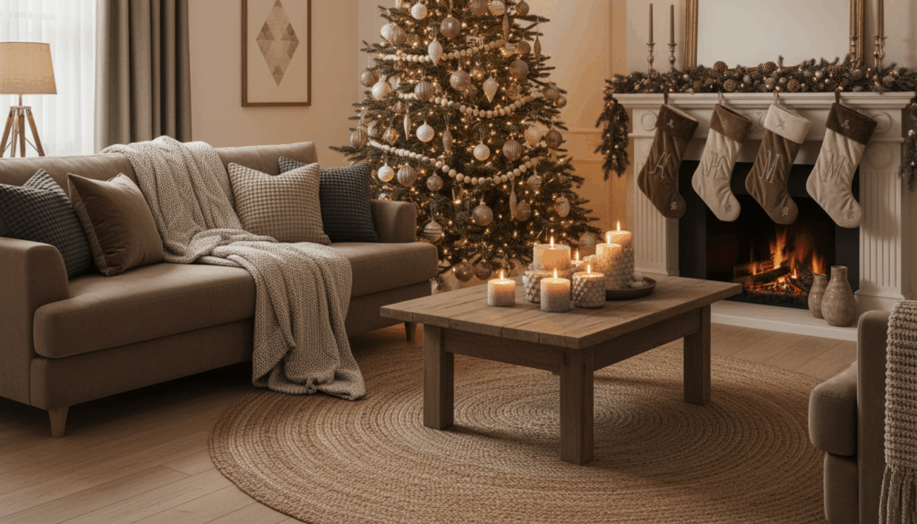
A Rise in Warm Neutrals and Cozy Palettes
Warm neutrals have become essential in both decor and fashion, and this influence extends into seasonal styling for 2025. Beige, sand, mushroom, cocoa, and warm ivory appear across ornaments, ribbons, tree skirts, stockings, and table scapes. These tones create a quiet foundation that allows accent colors to stand out with clarity.
Many homeowners embrace this palette due to its long term relevance. A neutral base rarely feels outdated, which gives you the freedom to experiment with accent colors that change from year to year. Warm neutrals also pair well with both traditional and contemporary homes, making them a flexible choice for anyone who wants to adjust their look gradually.
Texture plays an important role within this trend. Velvets, knits, woven fibers, etched ornaments, and matte glass add dimension and depth. The combination of texture and neutral color creates a sense of comfort that resonates with how people currently use their homes, especially during colder months when indoor gathering becomes central to daily life.
| Neutral Category | Common Shades | Best Applications | Why It Works |
| Soft Warm Neutrals | Beige, sand, warm ivory | Ornaments, ribbons, stockings | Creates a calm foundation that blends with many accent colors |
| Earth Driven Neutrals | Mushroom, cocoa, taupe | Tree skirts, mantel decor, garland accents | Adds depth and feels grounded in natural tones |
| Textured Neutrals | Velvet, knit, woven fibers | Pillows, throws, decorative elements | Enhances warmth through touchable materials |
| Matte and Etched Finishes | Matte glass, etched patterns | Ornaments and tabletop pieces | Provides subtle sophistication without overpowering other colors |
Jewel Tones Continue Their Momentum
Jewel tones have gained significant traction over the past three seasons, and their influence remains strong heading into 2025. Sapphire, emerald, amethyst, ruby, and citrine offer a regal, sophisticated look that pairs beautifully with both warm and cool lighting. These tones satisfy homeowners who want depth without heaviness, and they remain one of the most versatile choices in contemporary holiday decor.
What makes jewel tones especially powerful this year is their compatibility with neutral foundations. Emerald or sapphire ornaments placed against a backdrop of warm ivory or soft cocoa create a refined contrast that feels modern and elevated. Designers also note that jewel tones look exceptional in exterior lighting arrangements, particularly when paired with architectural silhouettes or landscape features.
Jewel toned palettes are expected to be especially popular among homeowners who want a curated, editorial look. These colors appear frequently in magazines, design blogs, and upscale retail displays, boosting their visibility and recognition.
The Influence of Global Design Shifts
Holiday palettes never exist in isolation. They reflect broader global influences that shape the way people think about color. The trending Christmas colors for 2025 demonstrate clear connections to several major design movements.
One influence comes from Scandinavian minimalism, which has affected home design for more than a decade. The rise of natural wood, soft neutrals, and simple silhouettes directly supports interest in calm, understated holiday palettes. Even when color becomes more saturated, it often retains the soft, grounded qualities associated with Nordic design.
Another influence comes from Japanese interior trends that prioritize craftsmanship, natural materials, and thoughtful color placement. Warm neutrals, muted pastels, and nature inspired greens link back to these principles.
Finally, there is a growing global interest in handcrafted goods. Items that look handmade or artisan produced complement many of the trending tones for 2025. This shift highlights the value homeowners place on meaningful decor, not just decorative abundance.
Metallics Take on More Nuance
While metallics never truly leave the holiday landscape, their presentation changes more frequently than many people realize. For 2025, metallics appear in softened, brushed, or layered textures that interact gently with both tree lighting and exterior lighting displays.
Champagne gold remains a favorite among designers because it bridges the gap between yellow gold and silver. Rose gold also continues its rise, though it appears in more muted, beige infused versions.
Textured metallics create a dimensional look that pairs beautifully with matte ornaments. Hammered surfaces, brushed finishes, and frosted glass integrate seamlessly into both traditional and modern decor styles.
These metallics also play an important role in exterior displays, where lighting interacts differently with reflective materials. When used outdoors, diffused metallics help create a warm glow without harsh reflections, giving homeowners more control over the visual intensity of their displays.
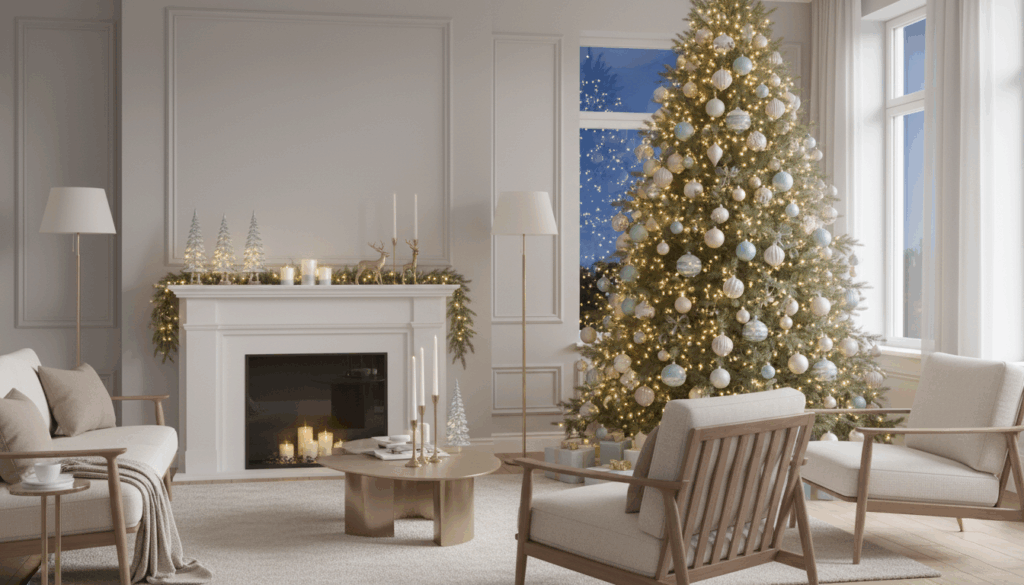
Soft Blues and Winter Pastels Gain Ground
Soft blues, icy lilacs, pale sage, and gentle blush tones carry significant momentum heading into Christmas 2025. These shades speak to a desire for calm, serenity, and simplicity. They work well with contemporary interiors that favor open spaces and airy textures.
Winter pastels pair unexpectedly well with metallics, especially champagne, pewter, and brushed bronze. Pastels also layer gracefully with whites and warm neutrals, allowing homeowners to build subtle gradients of color.
These palettes often appear in curated tabletop arrangements, mantle displays, and secondary trees designed for specific rooms. While pastels tend to be more niche in exterior displays, they can still shine in controlled lighting environments where subtle hues can be appreciated.
Bold and Playful Colors Arrive for 2025
Though many trends lean toward subtlety, there is also a growing movement toward bold, joyful palettes. This includes bright magentas, electric blues, tangerine, saturated mint, and vivid yellow. These colors appeal to families, younger homeowners, and people who enjoy a lively visual environment during the holiday season.
Retailers predict that this playful palette will appear in themed collections, such as candy inspired decorations, nostalgic ornaments, or retro styles. When done thoughtfully, these bold colors can pair beautifully with neutrals or monochrome backdrops.
The rise of LED and RGB lighting technologies also plays a role here. Newer lighting systems, including advanced RGB options that allow for custom scenes, have made it easier for homeowners to experiment with bolder colors inside and outside.
| Color Category | Example Shades | Best For | Notes on Visual Impact |
| Bright and Energetic | Magenta, electric blue, tangerine | Families and playful themes | Creates a lively atmosphere and stands out in nighttime displays |
| Retro Inspired | Saturated mint, vivid yellow | Nostalgic or vintage styles | Works well with themed ornaments and classic accessory shapes |
| Mixed Bold Palettes | Combinations of multiple high saturation colors | Creative, eclectic designs | Looks polished when balanced with simple neutrals or monochrome backgrounds |
| RGB Enhanced Displays | Custom color changing scenes | Homes using modern lighting tech | Offers flexibility and lets homeowners shift between multiple bold palettes |
How Lighting Influences Your Color Choices
Color and lighting interact in ways that can drastically change the look of a space. Warm lights enhance reds, golds, and neutrals, while cool lights intensify blues, greens, and metallics. This relationship becomes especially significant when selecting exterior palettes.
Professional lighting allows you to verify how colors will actually appear in real conditions. It also helps distribute light evenly, preventing color distortion. For example, a deep berry red may appear almost brown if placed in a shadowed corner without proper lighting. A soft sage ornament may turn gray under cool lighting. Understanding these interactions ensures that your palette appears exactly as intended in both day and night settings.
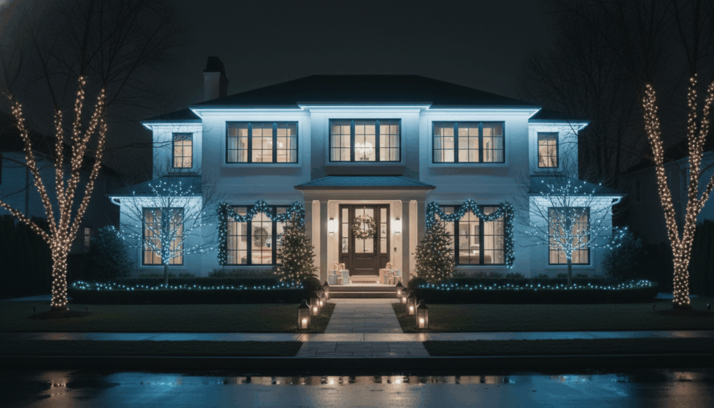
Creating Exterior Displays That Match Interior Color Themes
More homeowners are designing cohesive palettes that unify indoor and outdoor decor, and this approach gives the entire property a consistent aesthetic. To do this effectively, select a primary palette for your interior, then extend that theme outdoors through lighting, garland, wreaths, and pathway accents. While planning these elements, it can be helpful to review options for Christmas lights so you can understand how different colors and light types complement your chosen palette.
Warm neutral themes pair well with golden or champagne exterior lighting. Jewel tones look stunning when highlighted with warm white lighting. Winter pastels work best with cool white lighting or subtle RGB effects.
Exterior lighting also benefits from professional planning, especially in large suburban homes or properties with multiple architectural features. Accuracy, consistency, and color clarity make a significant difference in the final presentation.
Tree Decor and the Evolution of Seasonal Color Themes
The Christmas tree remains the centerpiece of most holiday displays, which means it often sets the tone for the entire home. Designers predict that trending Christmas tree colors in 2025 will reflect a blend of classic tones and modern accents.
Warm neutrals with brushed gold accents will be especially popular. Jewel tones layered with soft metallics will also continue to gain traction. Homeowners who prefer contemporary looks may lean toward winter pastels or soft botanical greens that connect to nature.
Textural diversity remains important in tree decor. A mix of matte, glossy, frosted, and metallic ornaments creates depth and visual interest. Ribbon styles, including woven fibers and soft velvet, help anchor the palette.
Expert Tips for Blending Trend Forward and Timeless Themes
With so many colors rising to prominence, one of the best strategies is blending long term classics with fresh accents. Many designers recommend picking a stable base palette, such as neutrals or metallics, then adding one or two trend forward colors that can be updated each year without replacing your entire collection.
For homeowners who enjoy changing their look seasonally, selecting ornaments in complementary tones makes it easier to rotate themes. For instance, deep green pairs well with jewel tones, neutrals, metallics, and even pastels. Berry red pairs well with both traditional and modern schemes.
Lighting can also help unify the look. Warm lighting tends to feel timeless, while RGB systems offer flexibility for those who enjoy playful or themed changes.
Looking Ahead at the Palettes Shaping Future Seasons
Color forecasting never stops. The palettes influencing 2025 will evolve into new combinations in the years ahead. Designers expect continued interest in natural tones, warmer neutrals, handcrafted textures, and layered metallics. Jewel tones are also likely to remain strong due to their versatility and depth.
Pastels may gain further momentum as interior design trends shift toward lighter palettes. Bold and playful tones will continue to appear, especially among younger homeowners who value personality driven decor.
Understanding the trending Christmas colors 2025 landscape gives you a strong foundation for the holidays ahead, whether you are refreshing a single room or reimagining your entire exterior display. These palettes celebrate comfort, creativity, and timeless seasonal joy.